A good environment is not only drawn in correct perspective. It also needs the right colours, believable textures and a clear composition so that the viewer knows where to look. Colour theory is the set of ideas that explains how colours mix, how they work together and how they make us feel. Layout is the planning of where everything – characters, props and the camera – goes in a scene.
Colour theory
The colour wheel
The colour wheel arranges colours in a circle so you can see how they relate. The traditional painter’s wheel uses red, yellow and blue:
- Primary colours – red, yellow and blue. They cannot be mixed from other paint colours.
- Secondary colours – orange, green and violet, made by mixing two primaries.
- Tertiary colours – such as red-orange or blue-green, made by mixing a primary with a secondary next to it.
Screens work differently: they mix light, and their primary colours are red, green and blue (RGB). That is why digital art software lets you pick colours using RGB values or a hex code such as #FF8C1A.

Hue, saturation and value
- Hue – the colour family (red, blue, green…).
- Saturation – how strong or dull the colour is.
- Value – how light or dark the colour is. Adding white makes a tint; adding black makes a shade.
Colour harmonies
Colour harmonies (colour schemes) are combinations that usually look good together:
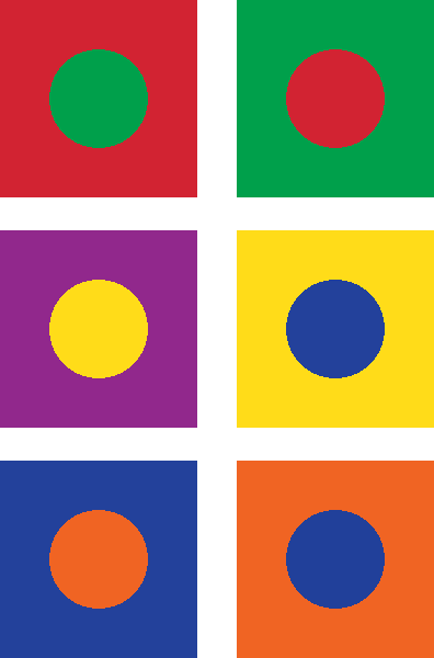
- Complementary – two colours opposite each other on the wheel, such as blue and orange. They create strong contrast and are great for making a character stand out from the background.
- Analogous – three or so colours next to each other, such as yellow, yellow-green and green. They feel calm and unified, which suits a peaceful forest.
- Triadic – three colours evenly spaced around the wheel, such as red, yellow and blue. They feel bright and playful.
- Monochromatic – different tints and shades of one hue.
Colours can also be warm (reds, oranges, yellows) or cool (blues, greens, violets). Warm colours tend to feel energetic and seem to come forward; cool colours tend to feel calm and seem to move back, which also helps with depth.
Texture
Texture is how a surface feels or looks as if it would feel: rough bark, smooth glass, wet sand, rusty metal. Actual texture can be touched (for example on a clay model), while visual or implied texture is created with marks, patterns, highlights and shadows. In 3D games, images called texture maps are wrapped around models to give them surface detail. Using a variety of textures makes an environment feel real and helps the player tell surfaces apart, such as which floor is slippery ice.
Composition and layout
Scene design
Composition is how the parts of a picture are arranged. Some useful guidelines:
- Focal point – decide on the most important thing and make it stand out using contrast, colour or light.
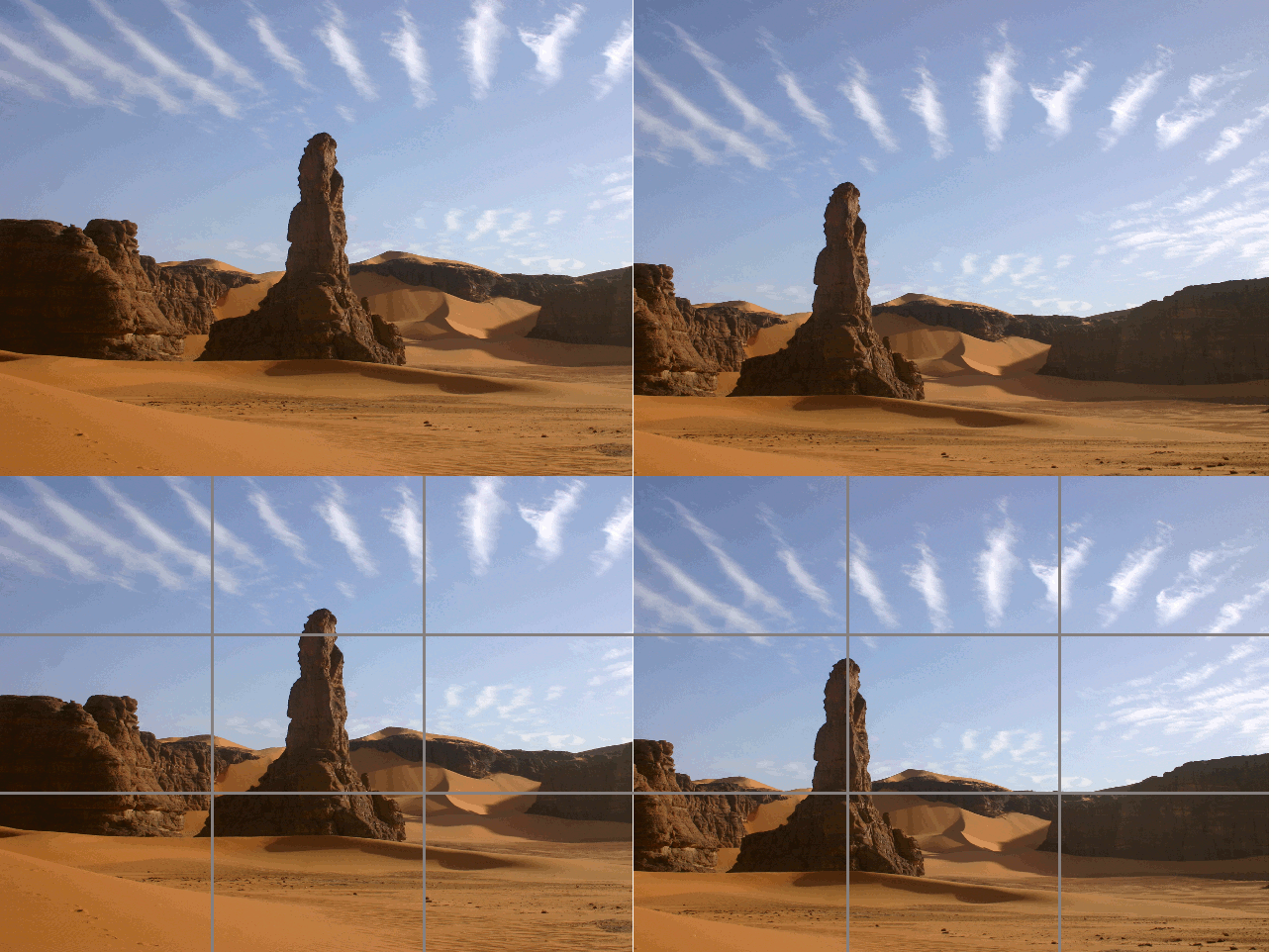
- Rule of thirds – divide the frame into a 3 × 3 grid and place important things on the lines or where they cross.
- Leading lines – roads, rivers or fences that lead the eye towards the focal point.
- Balance and framing – spread visual weight around the frame and use foreground objects such as trees or doorways to frame the action.
Blocking
Blocking is planning where characters stand and move in a scene, and where the camera is. In animation, the layout artist blocks out each shot with rough shapes before any detailed drawing, so the director can check the staging. In game design, level designers make a blockout (sometimes called a greybox): a quick version of the level built from plain boxes to test the size, paths and gameplay before the final art is made.

Example
For a scary night level in a jungle, you could choose an analogous scheme of dark blues and greens, then light a doorway in warm orange as the focal point (a complementary contrast). Rough bark and wet leaves give texture, and the doorway sits on a rule-of-thirds line. A quick blockout checks that the path to the door is clear before you paint anything.
Follow along with the video below, which explains the colour wheel and colour harmonies:
Exercise
- Paint or digitally colour a 12-part colour wheel. Label the primary, secondary and tertiary colours.
- Colour the same simple landscape twice: once with a complementary scheme and once with an analogous scheme. Which feels calmer?
- Make a texture sheet of six squares: rough, smooth, wet, furry, metallic and wooden.
- Sketch a scene using the rule of thirds, then draw a top-down blocking plan showing where two characters and the camera are.
Next: What Is a Level in Game Design? Structuring Gameplay and Outlining Your First Three Levels
Syllabus link: This post is relevant to the CAPE® Animation and Game Design Syllabus, Unit 1: Fundamentals of Animation and Game Design, Module 2: Drawing and Layout – Specific Objective 4 (“apply knowledge of design principles for environmental design”); Specific Objective 2 (“apply drawing and design principles for layout /environment and character development”).
Attributions to media used in this post:
Simple RYB Color Wheel without Title.png – Revulo.Studio – CC0 (via Wikimedia Commons)

Constrast of Complementary Colors – Clearer Version.png – 0xva – CC BY-SA 4.0 (via Wikimedia Commons)

RuleOfThirds-SideBySide.gif – Teeks99 (derivative of a photo by Pir6mon) – CC BY-SA 3.0 (via Wikimedia Commons)

Environments-02-shaman-hut.png – David Revoy / Blender Foundation – CC BY 3.0 (via Wikimedia Commons)

© 2026 Vedesh Kungebeharry. All rights reserved.
[…] Use a limited palette that matches the mood (see Colour Theory, Texture, Composition and Layout). […]
[…] Unit 1 we used many of these ideas for artwork in Colour Theory, Texture, Composition and Layout. Here we apply them to interactive screens: menus, HUDs, icons and game worlds that players must […]
[…] and tertiary colours, warm and cool colours, hue, saturation and value – were introduced in Colour Theory, Texture, Composition and Layout. This post focuses on why colour theory matters in animated and interactive work, and on designing […]